Official Brand Kit v2.0
RASHMÉ Logo

RASHMÉ

Editorial Minimalist Design System
01 / Core Palette Colors
Creamy Beige
#F5F0E8
Deep Black
#0D0D0D
Bloody Red
#9B1C1C
02 / Typography Fonts
Display — Playfair Display
Transformative Care
Used for massive editorial headlines and section titles. Italics are encouraged for emphasis (e.g. bottled).
Body — Inter
Formulated with 25 cold-pressed botanicals engineered to restore scalp vitality, deeply nourish hair fibers, and support natural pigment preservation from root to tip. Used for all paragraphs and UI elements.
03 / Logo Lockups Marks
RASHMÉ Logo
Primary (On Beige)
RASHMÉ Logo
Inverted (On Black)
04 / Product Packaging Assets
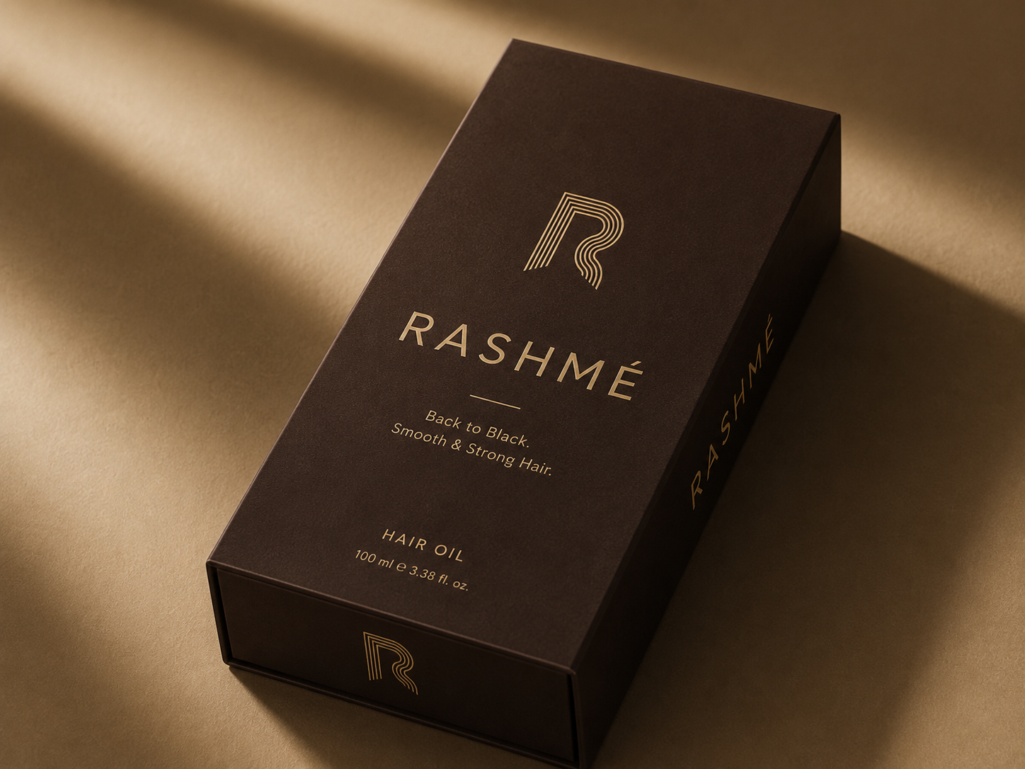
Outer Box Packaging

Outer Carton

Espresso black rigid board with Champagne Gold foil stamping. Used for retail display.
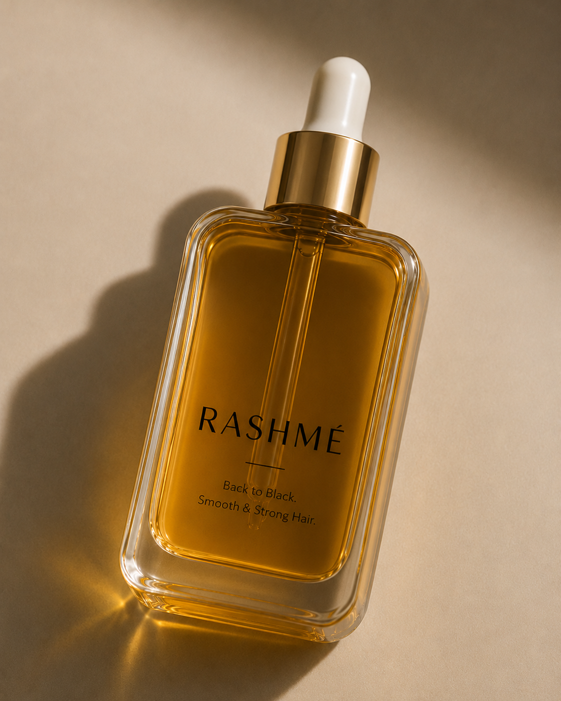
Inner Glass Bottle

Inner Glass Bottle

Premium dark amber glass with minimal typography and a gold-accented collar dropper.

05 / Visual Guidelines Rules

UI & Layout

  • Massive whitespace and generous padding is mandatory.
  • No rounded buttons (border-radius: 0) to maintain an editorial, high-fashion aesthetic.
  • Thin, sharp 1px borders using rgba(13,13,13,0.1).

Color Usage

  • Beige is the primary background. Never use stark white (#FFFFFF).
  • Black is used for all primary text and heavy contrast blocks (like the footer).
  • Red is an accent. Use strictly for underlines, active states, or key CTA buttons.